



AvaloniaAcrylic, or JuffMa.Controls.Acrylic as the package is named, is a small library containing a single control: AcrylicBackdropControl
What it does is draw an acrylic effect over whatever elements are behind it, optionally with rounded corners. This allows you to create such an effect in whatever way you want.
It uses the same ExperimentalAcrylicMaterial as its basis, just like Avalonia's OS based acrylic support.
First of all you need to install the nuget package:
dotnet add package JuffMa.Controls.Acrylic
After that, add the following namespace to the elements you want to use the control in:
xmlns:acrylic="clr-namespace:JuffMa.Controls.Acrylic;assembly=JuffMa.Controls.Acrylic"
Then just add the control where you like:
<acrylic:AcrylicBackdropControl Width="50" Height="50"/>Or, if you want something more fancy, you can specify a corner radius, effect and a material:
<acrylic:AcrylicBackdropControl
    CornerRadius="10">
    <acrylic:AcrylicBackdropControl.Material>
        <ExperimentalAcrylicMaterial
            TintColor="Black"
            TintOpacity="0.75"
            MaterialOpacity="0.3"/>
    </acrylic:AcrylicBackdropControl.Material>
    <acrylic:AcrylicBackdropControl.Effect>
        <DropShadowEffect BlurRadius="10"
                          Color="Black"
                          Opacity="0.3"
                          OffsetX="3"
                          OffsetY="5"/>
    </acrylic:AcrylicBackdropControl.Effect>
</acrylic:AcrylicBackdropControl>
Note that the control cannot take children. The easiest way to work around this is to just wrap it in a panel.
Since AcrylicBackdropControl inherits from Control you can use most basic properties like Effect. Additionally, as mentioned above, CornerRadius is built in.
Material takes an ExperimentalAcrylicMaterial but only TintColor, TintOpacity and MaterialOpacity are used. The first one is self describing.
The difference between TintOpacity and MaterialOpacity is that the latter is far more powerful and the former is used for fine adjustments.
Even the difference between TintOpacity at 1.0 and 0.0 is only a difference in saturation.
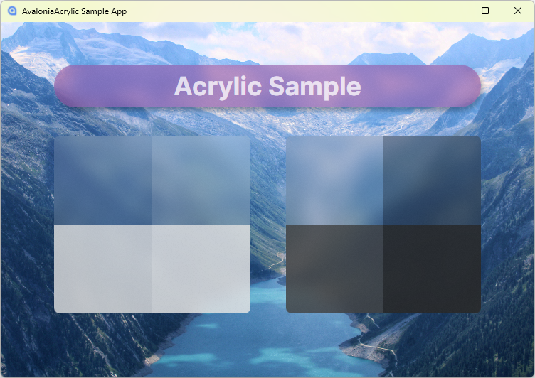
If you want to know more, you can find the example app (see image at the top) in the src directory.
In essence, it is just multiple Skia shaders overlayed with a paint that uses a blurred screenshot of the background as its base. This sounds heavy, and it kinda is, but it's not too bad since Skia is GPU accellerated. And let's be real, for UI like this you should never worry about performance too much.
This is 90% based on this control by Dani John and this gist by Nikita Tsukanov.
The core change is porting to Avalonia 12. It also cleans up the code a lot.
But AvaloniaAcrylic also introduces two new features: the rounded corners and a fallback software based renderer. The latter is especially useful in the preview, since it doesn't support GPU accelleration and would either display nothing or crash.
Still you very much want GPU accelleration. Make sure you include the right Skia natives and that your app is configured to enable GPU support.
(On Linux this might require explicitely setting the renderer priority, see Program.cs of example app)