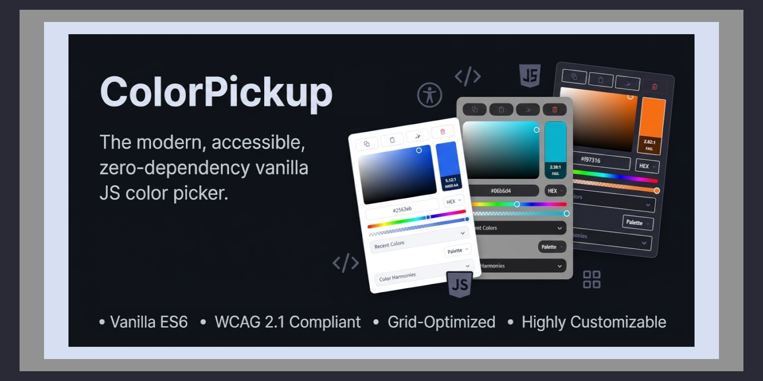
A highly accessible, grid-optimized, and customizable vanilla JavaScript color picker written in modern ES6. Convert any text input into a sleek, accessible color selector with zero third-party dependencies.
- Zero Dependencies: Lightweight, fast, and native.
- 8-Row Grid Layout: A highly structured, compact CSS Grid design resembling tools found in premium design software.
- 16 Visual UI Styles: Hot-swap layouts including
modern,macos,windows11,glass,figma,terminal,retro, and more. - 14 Palette Themes: Supports native and community-favorite themes like
dracula,catppuccin,nord,gruvbox, andamoled. - Field Mode Control: Flexible display states (
both,input, orcolor) to tailor how inputs and color thumbnails are rendered on your page. - Integrated WCAG 2.1 Audits: Real-time relative luminance calculations and contrast ratios overlay to verify accessibility.
- Color Harmonies: Dynamically computes complementary, analogous, triadic, and split-complementary colors.
- Persistent Color History: Automatically remembers recently used colors locally across sessions.
- Responsive & Adaptive: Fully compatible with desktop, mobile, touch controls, and high DPI viewport boundaries.
Include the compiled, minified production styles and scripts within your document's header:
<link rel="stylesheet" href="colorpickup.min.css" />
<script src="colorpickup.min.js"></script>
Or reference them directly via a secure CDN:
<link
  rel="stylesheet"
  href="https://cdn.jsdelivr.net/gh/Pro-Bandey/ColorPickUp@latest/dist/colorpickup.min.css"
/>
<script src="https://cdn.jsdelivr.net/gh/Pro-Bandey/ColorPickUp@latest/dist/colorpickup.min.js"></script>
Add the default data attribute data-colorpickup to any input field to activate the color picker automatically:
<input type="text" data-colorpickup value="#1e90ff" />Using the fieldMode option, you can configure how the picker represents your input fields on the page:
both(Default): Standard text input adjacent to a small, interactive color preview thumbnail.input: Displays the text input field only, removing all wrapper button layers entirely.color: Hides the text input field, showing only a square clickable color preview block that triggers the picker.
ColorPickUp({
  fieldMode: "color", // Hides the raw text box, displaying only the interactive swatch
});ColorPickUp can be configured programmatically by calling ColorPickUp() and passing an initialization object. The configurations are applied dynamically at runtime and can be adjusted on-the-fly.
ColorPickUp({
  style: "macos",
  theme: "catppuccin",
  animation: "bounce",
  components: {
    history: true,
    harmony: true,
    contrastChecker: true,
  },
});ColorPickUp({
// Append the color picker to a custom container (useful in scrollable panels)
parent: ".my-scrolling-container",
// A custom selector to bind inputs to. Accepts selectors or arrays of HTMLElements.
el: ".color-field",
// Toggle dynamic element wrapper containers
wrap: true,
// Enable basic right-to-left layout alignment
rtl: false,
// Choose from 16 UI Styles:
// 'classic', 'modern', 'rounded', 'terminal', 'retro', 'neon', 'chrome',
// 'firefox', 'adobe', 'figma', 'windows11', 'macos', 'fluent', 'glass', 'minimal', 'compact'
style: "modern",
// Choose from 14 Themes:
// 'light', 'dark', 'amoled', 'github', 'dracula', 'nord', 'solarized',
// 'catppuccin', 'tokyo-night', 'gruvbox', 'material', 'one-dark', 'high-contrast', 'auto'
theme: "light",
// Choose opening transitions: 'fade', 'scale', 'zoom', 'slide', 'bounce', 'none'
animation: "scale",
// Select field mode behavior: 'both' (input + trigger), 'input' (only input), 'color' (only trigger)
fieldMode: "both",
// Padding in pixels between the trigger element and the picker dialog
margin: 2,
// Output string formatting:
// * 'hex' : Outputs #RRGGBB or #RRGGBBAA
// * 'rgb' : Outputs rgb(R, G, B) or rgba(R, G, B, A)
// * 'hsl' : Outputs hsl(H, S, L) or hsla(H, S, L, A)
// * 'auto': Determines format from target input value
// * 'mixed': HEX if opacity is 100%, otherwise RGBA
format: "hex",
// Toggle format selector dropdown on Row 3 Right of the grid
formatToggle: true,
// Toggle Alpha opacity support on Row 5 of the grid
alpha: true,
// Force output of alpha values even at 100% opacity
forceAlpha: false,
// Hide spectrum/sliders, leaving only pre-defined swatches visible
swatchesOnly: false,
// Focus the text input when the picker dialog opens
focusInput: true,
// Select and focus the text input when the picker opens
selectInput: false,
// Clear button label (displayed on Row 1 Right)
clearLabel: "Clear",
// Close button label (displayed inside Row 2 Preview block)
closeLabel: "Close",
// Background/Foreground reference hex target for WCAG contrast calculations
wcagTextBackground: "#ffffff",
// Maximum capacity threshold for persistent recent colors array
historyLimit: 10,
// Module Toggles:
components: {
history: true, // Row 6 Recent Colors Accordion
palette: true, // Row 7 Swatch Grid
paletteSelector: true, // Row 7 Swatch Target dropdown selector
harmony: true, // Row 8 Generated Related Palette Accordion
eyedropper: true, // Row 1 Native Eyedropper API connector
copyPaste: true, // Row 1 Clipboard copy and paste controls
},
// Preset swatches array
swatches: [
"#264653",
"#2a9d8f",
"#e9c46a",
"#f4a261",
"#e76f51",
"#d62828",
"#0077b2",
"#0096c7",
"#00b4d8",
],
// In inline mode, the default color loaded on initialization
defaultColor: "#000000",
// Callback function triggered when a new color is picked
onChange: (color, input) => undefined,
});To ensure screen readers can announce controls correctly, customize or translate interactive labels by adding an a11y block to your global configuration:
ColorPickUp({
  a11y: {
    open: "Open color picker",
    close: "Close color picker",
    clear: "Clear selected color",
    marker: "Saturation: {s}%. Brightness: {v}%.",
    hueSlider: "Hue slider controller",
    alphaSlider: "Opacity slider controller",
    input: "Color hex value field",
    format: "Color output format selection",
    swatch: "Direct preset swatch button",
    instruction:
      "Saturation and brightness coordinate map. Adjust with navigation keys.",
    copy: "Copy color value to active clipboard",
    paste: "Paste color string from clipboard",
    eyedropper: "Activate viewport color eyedropper",
  },
});If you have multiple color inputs requiring independent layouts, styling engines, or behaviors on the same page, manage them cleanly using isolated virtual instances:
// Global class that include in every input
ColorPickUp({
  el: ".input",
});

// Inputs matching class '.special-fields' will load on a Figma Dracula layout
ColorPickUp.setInstance(".special-fields", {
  style: "figma",
  theme: "dracula",
  alpha: false,
  formatToggle: true,
  swatches: ["#264653", "#2a9d8f", "#e9c46a"],
});

// Inputs matching '.swatches-only' will hide spectrum elements entirely
ColorPickUp.setInstance(".swatches-only", {
  swatchesOnly: true,
  swatches: ["#ef4444", "#3b82f6", "#10b981"],
});
Any options omitted inside an instance block will seamlessly inherit values from your global configurations.
(Note: The settings el, wrap, rtl, inline, defaultColor and a11y must be configured globally).
All custom events are dispatched directly on the bound target input element:
| Event | Dispatched on | Description |
|---|---|---|
open |
Bound Input | Triggered when picker dialog resolves open. |
close |
Bound Input | Triggered when active dialog is terminated or saved. |
input |
Bound Input | Triggered inside dragging loops as hex/rgb target updates. |
change |
Bound Input | Fired when picker closes and the selected value has changed from original. |
colorpickup:pick |
document |
Global document listener retrieving active states through event.detail.color. |
document.addEventListener("colorpickup:pick", (event) => {
  console.log("Selected Color:", event.detail.color);
  console.log("Bound Element:", event.detail.currentEl);
});To manually dismiss an active dialog programmatically, use the close method:
// Close the dialog and save current state
ColorPickUp.close();

// Close the dialog and revert back to the original color value
ColorPickUp.close(true);-
Clone the git repository:
git clone git@github.com:Pro-Bandey/ColorPickUp.git
-
Navigate to the directory and install development dependencies:
cd ColorPickUp && npm i
-
Run the automated Gulp build pipeline:
npm run build
Uncompressed and optimized minified copies will compile straight into the
dist/folder. -
Run a continuous watch process for dynamic development compiling:
npm run start && cd dist && npx http-server -p 3030
T test Live go to
http://localhost:3030/dist/
Copyright (c) 2026 Pro Bandey.
ColorPickUp is released under the GPL v3.