Repository navigation
fix: move focus into the morph popover when it opens by keyboard - #195
Conversation


 l4u532
changed the title
291ccc7 to
e6386a8
Compare
l4u532
changed the title

|
One edge case: the autofocus selector can pick a hidden input/button or a disabled button with Could we skip hidden/disabled candidates and fall back to the panel if none can receive focus? |
e6386a8 to
61c3640
Compare
|
Thanks, fixed in 61c3640. I also rebased onto The panel now tries each candidate in order, Measured 2026-10-12 in Chrome and Safari 26 on a standalone bundle of the component, with and without the site's reduced-motion reset. Each row shows focus after Enter on the trigger:
Two related changes came out of the rebase:
Current-head visual evidence, captured October 14 in Chrome: reviewed candidate failure ( |
61c3640 to
d99c916
Compare
|
Rebased on Chrome and Safari confirmed candidate fallback, valid and disabled
|

The panel is a role="dialog" portalled to the end of <body>, but it never
took focus. A keyboard user who opened it from the trigger had to Tab
through the rest of the page to reach it. Consumers worked around this
one by one.

When Enter or Space opens the panel (a click with detail 0), focus now
moves to the first focusable element, or to the panel itself when it has
none. A new initialFocus ref on MorphPopoverContent picks another target,
such as the selected row of a list. A pointer open does not move focus.

The focus waits for the commit that makes the panel visible, because the
wrapper stays visibility: hidden until it is measured and focus() inside
a hidden subtree does nothing. A CSS transition on visibility can hold
the panel hidden a moment longer: the docs site's reduced-motion reset
gives every element a short transition-duration, and the first keyboard
open on a fresh page left focus on the trigger. A missed focus therefore
retries when that visibility transition ends, unless focus moved
elsewhere in the meantime.

Every registry item that bundles popover-morph.tsx has its date updated.
The keyboard-open autofocus took the first element matching its selector.
A hidden input or a disabled button with tabIndex={0} matches it, focus()
on them fails silently, and the retry aimed at the same element, so focus
stayed on the trigger.

Each candidate is now tried in order and the first one that takes focus
wins; initialFocus falls through to them when it cannot. With none, the
panel holds focus. While focus rests on the panel or the trigger, a
visibility transition that ends retries the whole list, so the reduced-
motion reset still lands on the first control. The retry stops at the
first key or pointer press, so it cannot move focus the user placed.

Hidden inputs are also left out of the selector. Passing onOpenAutoFocus
now hands focus to the caller, so DateRangePicker keeps its own target
and autoFocus={false} without a second focus move.
d99c916 to
b474722
Compare
|
Rebased on Chrome confirmed default focus, hidden and disabled candidates, valid and invalid Safari was paired with another WebDriver session, so this round is unverified there. The existing session was left untouched. Earlier Safari evidence remains dated to its checked revisions.
|

 starc007
left a comment
starc007
left a comment
There was a problem hiding this comment.
Thanks for this. A few things to look at, inline below.
One more that's outside the diff: components/motion/breadcrumb.tsx:254 still tracks event.detail === 0 and focuses the first link itself, which now duplicates what MorphPopoverContent does for a keyboard open (the description notes it focuses the same link twice). It only needs to keep its ArrowDown path.
| // Enter and Space fire a click with `detail` 0; a pointer click counts | ||
| // at least 1. Only a keyboard open moves focus into the panel. | ||
| ctx.focusOnOpenRef.current = | ||
| !ctx.open && (e as { detail?: number } | undefined)?.detail === 0; |
There was a problem hiding this comment.
Leftover flag can move focus on a later open. focusOnOpenRef is set here but only cleared inside the surface's layout effect. If this open never commits (a controlled parent ignores onOpenChange(true), or gates it like breadcrumb's open && present), the flag stays true, and the next open from code (a shortcut, the ContextMenu key, external state) moves focus into the panel even though no one pressed the trigger. Suggest clearing it whenever open becomes false in MorphPopover.
Separately, detail === 0 also matches screen-reader virtual clicks, voice control and any .click() call, so those paths now move focus too. Tracking whether a keydown or a pointerdown last happened on the trigger would be more reliable, and would remove the programmatic-click limit listed in the description.
| return `inset(${side === "top" ? inset : 0}% ${align === "start" ? inset : 0}% ${side === "bottom" ? inset : 0}% ${align === "end" ? inset : 0}% round ${radius}px)`; | ||
| } | ||
|
|
||
| const FOCUSABLE_SELECTOR = [ |
There was a problem hiding this comment.
This duplicates FOCUSABLE in lib/hooks/use-modal-scope.ts:5, and the two already differ: :not([disabled]) here still matches a button inside a disabled <fieldset>, which :not(:disabled) excludes, and the hidden-input exclusion exists only here. Could this be one shared selector in lib/? The registry bundles it automatically.
| ...panel.querySelectorAll<HTMLElement>(FOCUSABLE_SELECTOR), | ||
| ]; | ||
| for (const candidate of candidates) { | ||
| candidate?.focus({ preventScroll: true }); |
There was a problem hiding this comment.
Focused row can be out of view. preventScroll: true also stops the panel's own overflowY: auto area from scrolling. With the switcher example from the description, a selected row below the fold gets focus but stays hidden. Since the wrapper is position: fixed, a candidate.scrollIntoView({ block: "nearest" }) after a successful focus should bring it into view without scrolling the page.
| document.addEventListener("keydown", stop, true); | ||
| document.addEventListener("pointerdown", stop, true); | ||
| return stop; | ||
| }, [ |
There was a problem hiding this comment.
A re-run cancels the retry. The first run consumes the shared focusOnOpenRef. If any dependency changes afterward (e.g. initialFocus={cond ? refA : refB} flipping on the render after open, or onOpenAutoFocus toggling), the cleanup calls stop() and the re-run returns early because the flag is now false. In the reduced-motion window, focus then stays on the panel. A per-session local flag, or reading initialFocus through a ref so it's not a dependency, would avoid this.
| }} | ||
| className={cn( | ||
| "overflow-hidden border border-border bg-background", | ||
| "overflow-hidden border border-border bg-background outline-none", |
There was a problem hiding this comment.
With tabIndex={-1} the panel is now the fallback focus target, but outline-none leaves it with no visible indicator. When focus lands on the panel (text-only content, or the reduced-motion window), nothing on screen shows it (WCAG 2.4.7). Maybe add a focus-visible: ring here.
|
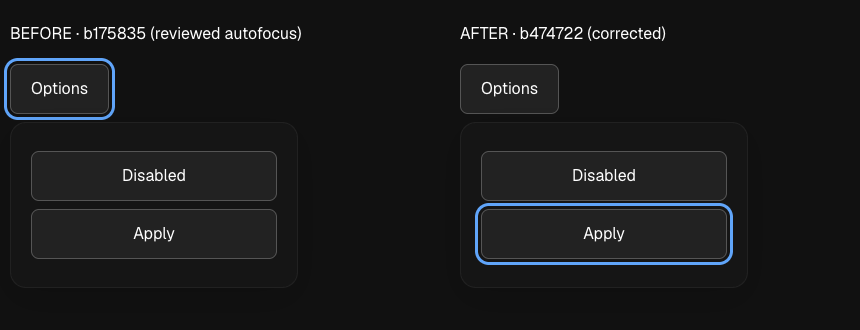
Added fresh Chrome focus media for the hidden and disabled candidate finding and the merged geometry. The reviewed first autofocus revision (
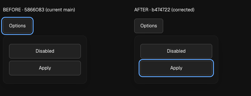
A separate pair compares latest main (
Captured October 14 in Chrome, with identical content, placement, theme and viewport. The screenshots show settled focus only. Safari was not captured. |

- Disarm the keyboard-open flag on the next key or pointer press, so a
  declined open cannot move focus during a later programmatic open.
- Detect a keyboard open from an Enter or Space keydown on the trigger
  followed by its click, so scripted click() calls no longer count.
- Run the open-focus effect once per open and read initialFocus and
  onOpenAutoFocus through refs, so new props mid-open keep the retry.
- Scroll the focused target into view within the panel.
- Show an inset focus ring when the panel itself holds focus.
- Share one focusable selector between the popover and useModalScope.
- Drop breadcrumb's duplicate Enter-path focus code.
- Add the changelog line and bump dates for every item that bundles a
  changed file.
A pointer press left the tooltip's shared input modality on pointer for
later test files, so keyboard-focus tooltip cases failed in CI.


tl;dr
<body>. It never took focus. After Enter on the trigger, a keyboard user had to Tab through the rest of the page to reach it.initialFocusref picks a different target.onOpenAutoFocus, the caller owns focus and the panel moves none. The date range picker passes it, so it keeps its own target and itsautoFocus={false}.Behaviour
MorphPopoverTriggerrecords whether the click that opens the panel came from the keyboard. Enter and Space give a click withevent.detail === 0. A pointer click keeps today's behaviour.initialFocus.currentfirst, then each element that matches its focusable selector, in document order. The first one that takes focus wins. With none, the panel itself holds focus (it now hastabIndex={-1}).focus()refuses. Examples are a hidden input, a disabled button that carriestabIndex={0}, and anything underdisplay: none. Those are skipped because focus does not move to them. Hidden inputs are also left out of the selector itself.Example: a switcher list that should focus its selected row.
Historical comparison captured October 12; current-head comparisons appear below.
main)Morph Popover demo on the docs site, Chromium, dark theme. Look at which element has the focus ring.
Timing
The portal wrapper stays
visibility: hiddenuntil the trigger and panel are measured.focus()inside a hidden subtree does nothing, so the focus runs in the layout effect of the commit that makes the panel visible, not on mount.A CSS transition on
visibilitycan keep the controls hidden a little longer. The docs site's reduced-motion reset gives every element a shorttransition-duration. In that window Chrome refuses focus on the buttons but accepts it on the panel. So the panel holds focus first, and eachvisibilitytransition that ends retries the whole candidate list. The retry stops when focus moves elsewhere, or at the first key or pointer press, so it cannot move focus that the user placed.Consumers
onOpenAutoFocusto focus a calendar date, so the panel moves no focus. Measured: the same focus target asmainin every case below.MorphPopoverTrigger, so it keeps today's behaviour.popover-morph.tsxare set to 2026-10-14.Browser checks
Measured 2026-10-12 in headless Google Chrome (Playwright) and in Safari 26 (safaridriver). The page was a standalone bundle of the real component, built with
bun build, with the old and new source side by side. Each case ran with and without the site's reduced-motion reset. Results are the same in both engines and in both motion modes. "Before" is the first version of this PR.tabIndex={0}button, Applydisplay: none, button withvisibility: hidden, ApplytabIndex={0}button, text onlyinitialFocuson a disabled button, ApplyAlso checked after a keyboard open in Chrome: Tab moves to the next control, Escape returns focus to the trigger, and a mouse open leaves focus on the trigger.
Date range picker, focus after open (Chrome):
mainLimits
maintoo. Its own focus call misses in the samevisibilitywindow. This PR does not change that.trigger.click()also hasdetail === 0, so it counts as a keyboard open.Rebase verification, 2026-10-13
Rebased on
ea3206d, which includes the latest Select changes. The conflict affected dates only.Main's newer dates remain intact. The autofocus implementation and accessibility cases applied without a code conflict.
Headless Chrome and Safari, sampled through
requestAnimationFrameon the actual component:initialFocusfalls back to the first control; validinitialFocustakes focus.onOpenAutoFocusretains caller-owned focus.Safari used synthetic keyboard-style clicks and key events. This pass does not replace the historical consumer checks above.
Safari reduced motion, real keyboard input, touch, exact narrow viewport, and iOS Safari remain unverified.
The independent cold read found no issue in the rebased diff. The temporary browser route was removed.
Rebase verification, 2026-10-14
Rebased on
5866083, the squash merge of #219. The conflict involved selector placement, panel attributes, and dates.The resolution keeps the full-size clip, one progress value, horizontal overflow guard, and exit cleanup through
safeToRemoveRef.It adds the focus selector and panel
tabIndexwithout restoring the removed clip variants or transition.The accepted #219 head and its squash merge have identical
popover-morph.tsxsource.All ten bundled dates already read October 14 on main, so the final date file has no diff.
Headless Google Chrome, sampled through
requestAnimationFrameon the actual before and after components:initialFocusfalls back; validinitialFocustakes focus.onOpenAutoFocusfocuses the caller's chosen control on both versions.scrollTop=0.Unverified, Safari: its instance was paired with another WebDriver session. This pass left that session untouched.
Earlier Safari results describe their dated revisions; they do not verify the merged geometry in this pass.
iOS Safari remains unverified. The temporary route was removed and the server stopped.
The current PR title states the autofocus outcome and remains accurate for a squash merge.
Both retained commit subjects also describe the final focus behavior. No obsolete animation claim remains in the merge summary.
Fresh focus media, 2026-10-14
Captured in headless Google Chrome with native Enter, identical content and normal motion. A hidden input and disabled
tabIndex={0}button precede Apply.The reviewed autofocus implementation (
b175835, parent of61c3640) leaves its focus ring on Options. The corrected head (b474722) focuses Apply. Escape returns focus to Options on both.The current main baseline (
5866083, merged #219) also leaves focus on Options. The corrected head (b474722) focuses Apply using the merged full-size geometry. This baseline is main, not the reviewed autofocus revision.Visible labels identify each revision. Both captures use the same trigger, children, placement, theme and viewport. These images show settled focus; they do not verify motion timing or retry cancellation. Safari was not captured in this pass.
Test plan
bun run check: typecheck, lint and all 107 registry components pass. Lint reports only the existing warning and infos.bun test: 152 pass.tests/popover-morph.a11y.test.tsxcovers these cases:initialFocusfocuses the chosen row.tabIndex={0}button and a hidden input are skipped. This case fails on the first version of this PR. The test DOM (happy-dom) lets hidden inputs and hidden elements take focus, so the browser checks above cover those./components/motion/popover, Morph variant. Focus the trigger and press Enter: the first item is focused. Click the trigger with a mouse: focus stays on the trigger.